|
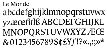
Above: Le Monde Roman as it appeared on the day of the newspaper's 50th anniversary, January 10, 1995.
|
The result of Le Monde, as launched January 9, 1995, was not, however, as
typographically pleasing as intended. In macrotypographic terms, Le Monde is still lacking
in photography, so it should, logically, rely on the integrity of the type design to provide it with its
authority and personality.
The text has met expectations. Legibility has been vastly improved,
the text flows better, so each line is more dynamic, as Jean-François Porchez intended. As
this publication reported, Le Monde also has firm roots with French Renaissance types, so the
historical connection is there, too.
Because of the great amount of text that each page has to
incorporate, particularly in the international and domestic news sections, Le Monde's open design
provides more "white space" without losing its robustness.
|
|
|
|
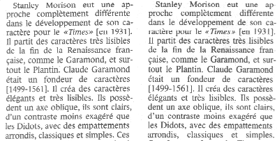
Left: Although it is difficult to see on the screen, this
shot does provide some idea of how different Le Monde (far left) is compared with Times. On hard copy, the
new typeface appears cleaner and crisper, and the improved copyfitting means more letters can be fitted
into the same space.
|
|
|
|
But the whole effect has been spoilt by the continuing use of the
Stone typeface for headlines. The Stone weights were commissioned from California-based type
designer Sumner Stone before the facelift. Stone has a lower x-height, destroying the equilibrium
of the page. It would have been ideal to have used Porchez's own Titling font, but for now Le
Monde Titling has not been accepted for composition in the newspaper, hurting the integrity of
the page as a result.
Jean-François explains, 'It must be remembered that the Le
Monde font family was created at the same time as the layout, therefore, not every version was
ready at the time the page make-up programs were conceived.
'At the time of the make-up of the layout, there were two conflicting
courses with regard to the titles: the first desired the use of several weights in neighbouring
bodies of text; the second, which I tended to follow, preferred using a single font set for very
different heights of text, providing a better rhythm to the pages.'
The retention of Frutiger for the subheads neither suits the titles nor
the text, especially considering that Jean-François Porchez has created a warm and legible
complement of sans serif fonts, which, since February 1995, have included italic complements.
The Le Monde Sans italics are "true", as opposed to "obliqued", or electronically slanted, designs,
which further have the same skeleton as their seriffed counterparts.
Le Monde Sans is used for the financial listings, but for curious
reasons, Frutiger 65 has been chosen to complement it. This is, again, caused by the concurrent
development of layout and the Le Monde type family, but it appears the mismatches are steadily
being corrected.
The public will have its chance to sample Le Monde in time.
Jean-François Porchez is developing a number of new families, including Le Monde Livres,
for larger point sizes (viz. 12 points and above), and Le Monde Courrier, 'designed in the spirit of
Souvenir', possibly for commercial sale.
Le Monde Livres will have a lower x-height plus several design
differences for the larger point sizes. The beta version is shown exclusively in CAP.
There will also be a titling series, to complete one of the most
comprehensive type families ever created since The
Times facelifted itself in the 1930s.
The main task has been done. The layout of Le Monde has
greatly benefited from a new text typeface that will keep the newspaper an enjoyable reading
experience in years to come.
|
|
![[CAP Online]](d01.gif)
![[Contents]](e01.gif)
![[Features]](e02.gif)
![[Newsroom]](e03.gif)
![[Issues]](e04.gif)
![[Register for Updates]](e05.gif)
![[Your Turn]](e06.gif)

![[Click here for next page]](bnext.gif)
![[Click here for previous page]](bprev.gif)