|
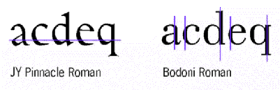
Above: Horizontal typefaces, such as Jack Yan's JY Pinnacle
are generally dynamic because the stress of the letters aids the eye rightward across the page. Vertical typefaces, such
as Bodoni Roman, are static and the vertical strokes disturb the reading pattern. Below: Oldstyle letters, because
of their origins in hand-lettering, have an oblique axis, which also helps legibility. New Century Schoolbook, pictured
at the right, has a vertical axis which disrupts reading.
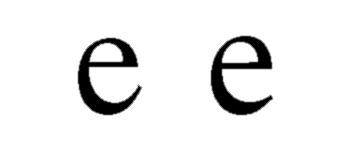
Above: Jean-François Porchez examined Times and saw it could be improved by allowing more white space
to "enter", thus improving legibility. He would do this by opening the end of the letter, and enlarging the counter (the "hole").
The result, above right, shows the improvement made to the letter 'e'. The same principle was applied to every letter's design.
Although it is difficult to imagine the effect with a single letter, once set into text, the improvement is very noticeable.
|
The creation of a typeface for Le Monde began with a proposal by its designer, Jean-
François Porchez, to the newspaper's director, Jean-Marie Colombani. The brief was to
create a new typeface that was horizontal, with an oblique axis, and with an improvement in
legibility. It was a departure from the Times Roman 9/9 pt that the paper had been using at that
stage.
When setting to work on his proposal, Jean-François Porchez -
already a Morisawa Award winner for his type design, Angie - took into account the difference in languages. The
same font has a different mood when set in French, Italian, English and German. There are
different occurrences of vowels: more in Latin languages, fewer in Germanic. Ascenders are less
frequent in Latin, too.
Porchez knew attention had to be paid to this aspect, plus the
historical basis of types such as Garamond, best suited to Latin-based languages.
The connection with oldstyle types such as Garamond was important,
to fulfil the "horizontal" requirement. Horizontality in type refers to the emphasis on the strokes.
Garamond has a fairly strong emphasis on its horizontal strokes, which aids the flow of settings.
In Latin settings, the eye would derive greater pleasure from a typeface whose characters directed
it across the line. Vertical typefaces, such as Bodoni, are too static for reading: there is not
enough of a connection between letters to enable the eye to move smoothly toward the right.
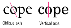
Garamond also has an oblique axis. This refers to the central vertical
axis of round letters such as the 'o'. In calligraphy, letters were rendered so that the axis would
be diagonal, which again aids the "link" to the next letter. Letters with a vertical axis prove static
and disturb the harmony of text.
Further, Jean-François Porchez felt the type family must reflect
its culture; it must take into account the composition and printing technology; and save 10 per
cent in space without having to shorten the articles, "ventilating" the layout.
He had researched newspapers and their use of type, from The Times to Le Midi Libre and the
current Le Monde. He found that the print in Le Monde - composed in Times New
Roman, which The Times of London itself
abandoned in 1971 - was less than ideal compared to the other papers'. The types used
nowadays had greater x-heights and smaller capitals and ascenders. Because little of the text is
set in capitals, there was no need to make them monumental as Stanley Morison's committee
had done for Times New Roman in 1931.
Studying Times Roman, Porchez critiqued each letter and declared that
Le Monde had to be an open typeface. The openness would again contribute to the legibility: a
closed design has vertical elements which tend to make text static. Porchez's concerns were with
the printing: closed typefaces would be more subject to printing degradation than an open one.
With each letter, he says, 'I tried to make each letter as visible as
possible in small point sizes by introducing more white space, and that lightened the interior.'
|
|
![[CAP Online]](d01.gif)
![[Contents]](e01.gif)
![[Features]](e02.gif)
![[Newsroom]](e03.gif)
![[Issues]](e04.gif)
![[Register for Updates]](e05.gif)
![[Your Turn]](e06.gif)
![[Click here for next page]](bnext.gif)
![[Click here for previous page]](bprev.gif)