Features

Click here if you do not see the menu bar above
Home | Contents

icon


Odermatt & Tissi

S W I T Z E R L A N D ' S best-known design consultancy is arguably Odermatt & Tissi, Zürich. When Odermatt & Tissi-designed arts' posters were exhibited at New York's Reinhard-Brown Gallery in 1992, they fetched prices as high as $1,700 each. It is hard to ignore the impact the designers have had on the international design scene, with their clear yet

Insurance
Making insurance interesting: leaflet for insurance company, 1960

dramatic use of colour and type.
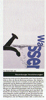
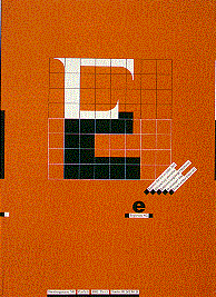
   Siegfried Odermatt originally wanted to be a photographer and worked at a few photographic studios and advertising agencies before becoming inspired by graphic designers such as Max Huber. Self-taught, Odermatt opened his design studio in 1950, at the age of 24. Without the formal training from the Swiss design schools, Odermatt soon made his name with breaking the traditional rules, using

BBC Brown Boveri
Product information sheet for Swiss engineering group BBC Brown Boveri

colour, dramatic cropping of photographs, and the division of space on a page. He continued alone until the arrival of Rosemarie Tissi in the early 1960s, who was made a partner in 1968.
   Tissi was trained at the Kunstgewerbeschule in Zürich, and soon joined a design consultancy in Winterthur - where she was expected to do little more than answer the telephone. This frustrated the young designer, who soon met with Odermatt and became his apprentice.
   The approaches of the pair are also markedly different. They do work together in that one has responsibility for a project while the other critiques, but their work is not done together. Odermatt tends to keep his workspace tidy; Tissi, with a half-Italian, half-Swiss background, keeps hers disorganized.
   However, the two think on the same plane,

Kieler Woche Serenade concert
Left Poster for sailing week in Kiel, Germany, 1992. Right Poster for serenade concert series, Zürich, 1995

as one usually likes the work of the other, and the work has a common style that rises above usual graphic design. Wolfgang Weingart calls the partners' work 'more inventive, more imaginative, and above all, more subtle,' innovating without being explicit.
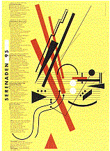
   They also have another factor in common: both judge their work not by the standards of the industry, but by their own. They are sensitive to commercial factors, of course, but like artists they have their own stylistic ideals. The work must express who they are as well as the aims of the client. Each project must appear new, but the jobs also have, Tissi claims, the soul of the designer within them.
   The work is still done by traditional methods, without the use of a Macintosh in the studio. There is no mouse, thanks to the partners' pet, Michelle the cat.

EDesign aus den Niederlanden

Far left Poster advertising the Type Directors' Club exhibition for the German Poster Museum in Essen, 1985. Left Using the Dutch national colours for the Design from the Netherlands exhibition, 1982.

TopHome | Contents

Your comments are welcome


Typos
You can see some O&T posters in the flesh (or, more accurately, on the wall) at JY&A Fonts' Swiss distributor Typos, Erlachstrasse 26, Zürich 3, Switzerland.


JY&A corporate home page

Copyright ©1998-9 by JY&A Media, a division of Jack Yan & Associates. All rights reserved.
Send us feedback here.