|
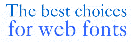
Creating a font from scratch is a time-consuming business. So we don't expect everyone to follow in the footsteps of this month's special feature. Given, though, that you need to specify a good font for a publication on the web, or need to consider the web for a corporate or brand identity, here's our guide to finding the right font for the medium.
|
1. Sans serif types are better than serif types.
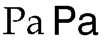 Sans serif means "without serifs", referring to the little tails at the ends of letters in, say, Times and Palatino (left). In web publishing, many people are using low-resolution monitors where seriffed fonts can look clumsy. The main problem is that serifs look too big because each takes up a pixel - when the whole character may only be six or seven pixels wide. In a book, this can be distracting, and the screen is no exception. Unless you really need the "serious" tone of a seriffed font, <font face> tags should point to a sans serif typeface. Typical examples are Helvetica (example on right) and Arial. The same rules apply even when you're doing text as a GIF. Sans serif means "without serifs", referring to the little tails at the ends of letters in, say, Times and Palatino (left). In web publishing, many people are using low-resolution monitors where seriffed fonts can look clumsy. The main problem is that serifs look too big because each takes up a pixel - when the whole character may only be six or seven pixels wide. In a book, this can be distracting, and the screen is no exception. Unless you really need the "serious" tone of a seriffed font, <font face> tags should point to a sans serif typeface. Typical examples are Helvetica (example on right) and Arial. The same rules apply even when you're doing text as a GIF.
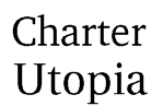
2. Get x-heighted.
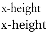 The x-height refers to the height of the lowercase letter, or, more specifically, the 'x'. Fonts with low x-heights, e.g. Monotype Garamond or JY Ætna (top line). We read lowercase more often than caps, and lowercase letters are also more distinctive, which makes them easier to take in. But those lowercase letters need to be sufficiently big to be clear. So, for seriffed fonts, Matthew Carter's Georgia is a good choice, as is Adobe Utopia (bottom line). The x-height refers to the height of the lowercase letter, or, more specifically, the 'x'. Fonts with low x-heights, e.g. Monotype Garamond or JY Ætna (top line). We read lowercase more often than caps, and lowercase letters are also more distinctive, which makes them easier to take in. But those lowercase letters need to be sufficiently big to be clear. So, for seriffed fonts, Matthew Carter's Georgia is a good choice, as is Adobe Utopia (bottom line).
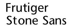
3. Holey fonts, Batman!
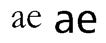 A font with big holes, or, more accurately, counters, is easier to read than one with small holes. Look at the lowercase 'e'. The hole should not be tiny as in Monotype Garamond (left) or JY Pinnacle, but well-balanced as in Helvetica or Frutiger (right, at, believe it or not, the same point size). Why are the holes important? Compare, say, reduced photocopies. The first time round, the photocopy may be all right to read, but by the second or third generation, there are difficulties. The main reason for this is that in many cases, the letters' holes get filled in. We've been conditioned to recognize the negative spaces as well as the positive spaces, so we need holes as much as the letters around them. A font with big holes, or, more accurately, counters, is easier to read than one with small holes. Look at the lowercase 'e'. The hole should not be tiny as in Monotype Garamond (left) or JY Pinnacle, but well-balanced as in Helvetica or Frutiger (right, at, believe it or not, the same point size). Why are the holes important? Compare, say, reduced photocopies. The first time round, the photocopy may be all right to read, but by the second or third generation, there are difficulties. The main reason for this is that in many cases, the letters' holes get filled in. We've been conditioned to recognize the negative spaces as well as the positive spaces, so we need holes as much as the letters around them.
4. Keep it upright
Italics aren't very legible on screen, because the pixels don't go diagonally too well. They begin to look coarse, unless you're on a high-resolution monitor which makes the letters look more "solid". Unless you have to italicize (because of accuracy, e.g. in movie titles, or stressing a couple of words), stick to upright, or roman, fonts.
5. Be distinguished.
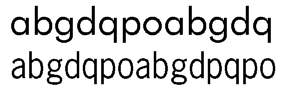 You need a typeface which doesn't confuse people. Typefaces like Futura (top line), ITC Avant Garde Gothic and Monotype Century Gothic, for example, have characters such as 'a', 'o', 'd', 'g', 'b', 'p', 'q' the way we were taught them at school: i.e. single-storey. But on the web, if the letters get too close, there are legibility problems. Find a typeface which distinguishes between the commonly used letters more. Vincent Connare's Trébuchet is a good example, as is Jean-François Porchez's FF Angie. Shown here is News Gothic (bottom line), which also works. You need a typeface which doesn't confuse people. Typefaces like Futura (top line), ITC Avant Garde Gothic and Monotype Century Gothic, for example, have characters such as 'a', 'o', 'd', 'g', 'b', 'p', 'q' the way we were taught them at school: i.e. single-storey. But on the web, if the letters get too close, there are legibility problems. Find a typeface which distinguishes between the commonly used letters more. Vincent Connare's Trébuchet is a good example, as is Jean-François Porchez's FF Angie. Shown here is News Gothic (bottom line), which also works.
6. Open up.
Related to point 5, the ideal web typeface should be "open". The 'C' in ITC Avant Garde, for instance, curls back, almost looking like an 'O'. If the hinting, however (see 'Set on the Web'), is good, then "openness" is not as important as it is in print.
7. Forget the above.
For titles, if they're big enough, you should feel free to express yourself. Typefaces are created to help you express, so if it's a piece about clowns, go and use a font made up of balloons in a GIF image.
So what's on the list?
We reckon fonts such as the following are good for web use:
All font names listed below are trademarks or registered trademarks of their respective owners. Notices for some typeface names are given at the foot of this page.
 Berthold Akzidenz Grotesk
Avenir
Berling
Berthold Boton
Calvert
ITC Charter
JY Décennie
ITC Franklin Gothic
Frutiger
Microsoft Georgia
Granby
ITC Kabel
ITC Legacy Sans
 Lucida, Lucida Fax, Lucida Bright
FF Meta
Le Monde Sans, Le Monde
News Gothic
Berthold Poppl-Laudatio
Serifa
ITC Stone Sans, ITC Stone Serif
FF TheSans, FF TheSerif
Microsoft Trebuchet
Adobe Utopia
Microsoft Verdana Lucida, Lucida Fax, Lucida Bright
FF Meta
Le Monde Sans, Le Monde
News Gothic
Berthold Poppl-Laudatio
Serifa
ITC Stone Sans, ITC Stone Serif
FF TheSans, FF TheSerif
Microsoft Trebuchet
Adobe Utopia
Microsoft Verdana
|


 Copyright ©1997-8 by Jack Yan & Associates.
All rights reserved. All trademarks are the properties of their respective owners and may be subject to protection in certain jurisdictions. They are used here in an editorial fashion only. 'Avenir', 'Helvetica', 'Times', 'Palatino', 'Frutiger', 'News Gothic' and 'Serifa' are trademarks of Linotype-Hell AG and/or its subsidiaries. 'Designature', 'CAP' and 'CAP Online' are the properties of Jack Yan & Associates. Email us here.
Copyright ©1997-8 by Jack Yan & Associates.
All rights reserved. All trademarks are the properties of their respective owners and may be subject to protection in certain jurisdictions. They are used here in an editorial fashion only. 'Avenir', 'Helvetica', 'Times', 'Palatino', 'Frutiger', 'News Gothic' and 'Serifa' are trademarks of Linotype-Hell AG and/or its subsidiaries. 'Designature', 'CAP' and 'CAP Online' are the properties of Jack Yan & Associates. Email us here.
