|

Garry Emery is one of Australia's best-known designers. His most famous typographic work was the design of the monumental typeface for the Romaldo Giurgola-designed Australian Parliament, opened in 1988, although it is by no means the only custom typeface he conceived. He is a highly respected graphic designer in his own right, and one of the principals of Emery Vincent Design, arguably the best-known design consultancy in the country. Emery Vincent Design opened in Melbourne in 1981, and its Sydney office five years later.
Which work has influenced you most strongly?
For me there is no single work, ad, typeface, or piece of design that stands out as a key influence.
For that matter, there is no single designer who has had a profound influence on my work. Rather, there are many and varied influences and people whose work I admire from the different disciplines of design and the arts.
To name a few artists Marcel Duchamp, Pablo Picasso and Antonio Tapies; architects Tadao Ando and Frank Gehry; typographer Piet Zwart; designer architect Charles Eames; sculptors Isamu Noguchi and Constantin Brancusi; jazz musician Keith Jarrett; and composer Johann Sebastian Bach. architect Charles Eames; sculptors Isamu Noguchi and Constantin Brancusi; jazz musician Keith Jarrett; and composer Johann Sebastian Bach.
The movements in art and design that I most respond to are constructivism, dada, surrealism, modernism, expressionism and minimalism.
How did you get into this field?
I was born in Western Australia. I have had no formal training in graphic design, having left school at 14 to work in a commercial art studio. In 1960, I moved from Perth to Melbourne, and got a job hand-lettering on cosmetic and pharmaceutical packaging. It was the start of a fascination with calligraphy and typography, and the awareness that the written word communicates more than specific information, but also expresses attitudes and evokes images.
How do you see design and your approach to it?
My design sensibility has been formed by exposure to an eclectic array of 20th-century artists and art movements. I am a modernist but without dogma, a typographic traditionalist who seeks out the freedom of the accidental, a pragmatist who balances the rational and the lateral simultaneously. I design opportunistically, approaching each design commission as an exploration. I apply no design formula or prescription.
I have an essential interest in letterforms, typography, calligraphy, two-dimensional space and three-dimensional space, and art and design history. I have developed a number of custom-designed typefaces for specific projects.
My work incorporates design references of our times, both from high art and popular culture. All design creativity emanates from hidden conversations with other artists and designers. Creativity emanates from making references and homages to others' work, which in turn inform and enlarge the design conversation across time and space. My hidden agenda is to culturally enhance the visual landscape.
The basic task of every piece of design is to be effective. In the case of graphic design for print and electronic media, this means simply selling products, services and ideas and developing corporate identities. I have developed a sensitivity for marketing and corporate identity, based on design thoroughness and pragmatism. For the built environment, it means making a sense of place and imparting public information.
How do you think your work has contributed to the Australian visual language?
I have trouble with the assumption that there is an "Australian" visual language. Perhaps it's easier for outsiders to perceive distinct trends and characteristics that could be described as Australian. I can say that any Australian cultural activity must inevitably express an essentially hybrid, plural condition after all, we are a melting pot of different ethnic and cultural influences. Maybe some day, this will all coalesce into an identifiably regional design expression. Or maybe not.
In the late 1980s, we designed a new typeface for the inscriptions planned for Australia's new Parliament House. The existing Roman inscription typefaces were thought to be unsuitable to express the values of this significant, contemporary national monument. As part of our research, we compiled a dossier showing examples throughout the history of Australian type and analysed what we found, looking for any trends we could identify as somehow Australian. Really, although we would love to have discerned some evidence of a developing vernacular, there was nothing we could identify that was particularly distinctive.
But some do observe certain characteristics in Australian design work, such as bright sub-tropical colours and informalityelements which no doubt responses to our strong sunlight, warm climate and easy-going social manner. But is there an Australian design sensibility? I think that we are just as connected to the rest of the worldand to the history of the significant design movementsas anyone in New York, Paris or London, and that is what is most likely to define us as designers working in Australia.
 Home | Contents Home | Contents
Your comments are welcome
|
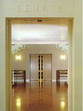
Above One of Garry Emery's typeface designs grace the Australian Parliament. This typeface, conceived in the late 1980s, is a seriffed monumental style with the width and clarity of ITC Avant Garde and Futura.
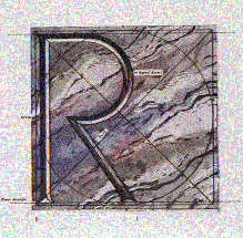
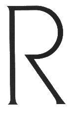
Above The capital R, in development drawing form. The typeface was scanned into Adobe Illustrator for further manipulation. The final R is below.
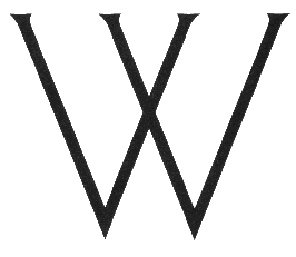
Below Other glyphs from Emery's Australian Parliament Typeface.

Emery Vincent Design
80 Market Street
Southbank, Victoria 3006
Australia
Telephone 61 3 96-99-38-22
Fax 61 3 96-90-73-31
|